Friday, 24 May 2019

The best ways to connect to the server using Angular CLI


Everybody who has used Angular CLI knows that it is a powerful tool which can take a front-end development job to a completely different level. It has all the common tasks like live reload, typescript transpiling, minification, and more. And it’s all preconfigured and ready to use with one simple command:
ng build, ng serve, ng test.
But there is one (and a very important one) task that needs to be configured once the application is ready to start showing some data from the server…
Yes, no matter how great the Angular framework is, and how quickly and performant its components — at the end the purpose of SPA (single page application) is to interact with the server through HTTP requests.
And here is the first obstacle that appears before every Angular CLI newbie: the Angular project runs on its own server (which runs by default at http://localhost:4200). Therefore, the requests to the API server are cross-domain, and, as you might know, the security of the web browser disallows the making of cross domain requests.

Approach #1: proxy

Of course, the people at Angular CLI foresaw this issue and even built a special option for running an Angular project using a proxy configuration:
ng serve  —-proxy-config proxy.conf.json
What is a proxy, you might ask? Well, browsers don’t allow you to make cross domain requests, but servers do. Using the proxy option means that you’re telling Angular CLI’s server to handle the request sent from Angular and resend it from the development server. This way, the one who “talks” with the API’s server is Angular CLI’s server.
The proxy configuration requires the proxy.conf.json file to be added to the project. This is a JSON file with some basic settings. Here is an example of the contents of proxy.conf:
{
  "/api/*": {
    "target": "http://localhost:3000",
    "secure": false,
    "pathRewrite": {"^/api" : ""}
  }
}
This code means that all requests that start with api/ will be resent to http://localhost:3000 (which is the API server’s address)

Approach #2: CORS

Browser security doesn’t allow you to make cross domain requests unless the Control-Allow-Origin header exists at the server’s response. Once you configured your API server to ‘‘answer’’ with this header, you can fetch and post data from a different domain.
This technique is called Cross Origin Resource Sharing, or CORS. Most of the common servers and server frameworks like Node.js’ Express, or Java Spring Boot can be easily configured to make CORS available.
Here is some example code which sets the Node.js Express server to use CORS:
const cors = require('cors'); //<-- required installing 'cors' (npm i cors --save)
const express = require('express');
const app = express();
app.use(cors()); //<-- That`s it, no more code needed!
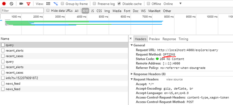
Note that when using CORS, before each of the HTTP requests are sent, it will follow after the OPTIONS request (at the same URL) that checks to see if the CORS protocol is understood. This “double request” may affect your performance.

Production Approach

Ok, your Angular project is “talking” smoothly with server, getting and sending data in the developer environment. But the time of deployment has finally come, and you need your beautiful and preformant Angular app to be hosted somewhere (far away from Papa Angular CLI). So again you face the same problem: how to make it to connect to server.
Only now there is a big difference: in the production environment (after running ng build command), the Angular app is no more than a bunch of HTML and JavaScript files.
Actually the decision on how to host the application on the production server is an architectural decision, and architecture is far beyond the scope of this article. But there is one option I recommend that you consider.

Serve Static Files From the API’s Server

Yes, you can host your Angular project (once it has only HTML and JavaScript files) on the same server where data (APIs) is served from.
One of the advantages of this strategy is that now you do not face any “cross-domain” issues, since the client and API are actually on the same server!
Of course, this approach requires the API’s server to be configured properly.
Here is the code that exposes the “public” directory where Angular files can be hosted when using the Node Express server:
app.use(express.static('public'));  //<-- public directory that contains all angular files
Note that in this case, the way your app accesses the API in the development environment will be different from the way the API accessed it at production. Thus you may need to use different HTTP URLs in different environments (Like api/users/1 at dev and users/1 at production). You can use Angular CLI’s environment option to achieve this:
// users.service.ts
const URL = 'users';
return this.http.get(`${environment.baseUrl}/${URL}`);
...
// example of environment.ts file:
export const environment = {
  production: false,
  baseUrl: 'api',//<-- 'API/' prefix needed for proxy configuration 
};
// example of environment.prod.ts file:
export const environment = {
  production: true,
  baseUrl: '', //<-- no 'API/' prefix needed
};

Conclusion

Angular CLI is without doubt a very powerful and robust tool . It makes our lives as front end developers easier in many ways. But it also requires you to make an architectural decision about the connection to the API’s server. Therefore, you need a clear understanding of the various ways client-server communication may be established.
This article lists two approaches of handling this issue in the developer environment and also one recommendation about production architecture.
Try to play with various compilations and see which one feels more convenient for you and your team.
Have fun and let me know how it goes!

Wednesday, 1 May 2019

21 Award-Winning Website Designs & What They Did Right

The internet is full of some amazing and inspiring websites.
These special snowflakes are the ones who find innovative ways to utilize every possible design and technological boundary to their advantage to create experiences that many organizations wish they had.
Finding these diamonds in the rough can be an incredible challenge, especially if you're planning a website redesign and are unsure of where to start.
Fortunately, sites like CSS Awards, Awwwards, Webby Awards, etc. exist to help highlight the sites we should push our own to reflect.
To help showcase some of these awarding winning sites, I dove into each of these award-honoring sites and pulled the ones that are not only beautiful examples of modern design, but also exercise UX, UI, information architecture, conversion rate optimizationvideo marketing, tactics to their fullest potential.
When looking at each site, it’s important to understand that these should not be seen as templates you should attempt to copy. Instead, analyze them and find the parts of them that utilize design/marketing/content strategies that could be repurposed and revised into that fits your own audience.
With that being said, enjoy these 17 killer examples of award-winning website designs done right.
Rather watch? Here are 5 of my favorites!

1. ESPN Sports Programming

espn-sports-programming.png
Article Continues Below

Enter to win a Free Ticket to IMPACT Live +4 Awesome Marketing Books

TIME LEFT
30
 : 14
 : 53
 : 23
Enter to Win
Marketing Event Free Ticket
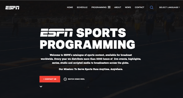
ESPN takes their sports content and programming to the next level with this dynamic and eye-catching site filled with large, high-resolution images and video. The site utilizes background video to keep up with the sports network’s energy and sections with subtle hover and transition effects and to keep the user experience smooth. The ‘featured sports’ slider is thoroughly entrancing, and does an excellent job of showcasing each of the sports alongside interesting statistics and informative details about available programs. 

2. Montage

montage.png
Montage takes showing-off their product to the next level with this easy to maneuver homepage that clearly outlines what their product is, how it looks, product quality, and testimonials. The site is an excellent example of one approach you can use to highlight your product and the most important points your users would be concerned with finding answers to. The sticky sub-navigation allows users to easily navigate around the page to find exactly what they're looking for.  

3. Zillow

zillow.png
Finding the perfect home is all about being able to conveniently research exactly what you’re looking for, save and store what you like, and make it easy to find it all later on. Zillow hits the nail on the head for all three of these points with their intuitive real estate site. The search area within the hero area makes it easy for new users to quickly select and search listings without having to look for some hidden search page. 

4. Revols

revols.png
Revols takes a bold approach on its website by enlarging their small, sophisticated headphones using macro photography and video. The photography and video make the site incredibly product focused, so their users slowly become more and more immersed into the experience these headphones can give you. The large font treatment on this site is also a nice touch and adds to the larger-than-life earbud photography. 

5. Fiftythree Pencil

53-pencil.png
Fiftythree captures all the features and benefits for their Pencil Stylus throughout this standalone product page. These features and benefits are accompanied by images to illustrate the product in action so the user has an easier time visualizing them and how they can apply the product. The layout and visual treatment of the product's anatomy section are also very unique and act as a dynamic way to lead users to read more about the product, as opposed to static sections one after another. 

6. Morgan Stanley

morgan stanley.png
Unlike traditional product-focused sites, Morgan Stanley headlines their homepage with an article they hope to drive a significant amount of traffic to (especially since it connects with the holiday family gatherings we’re expected to attend). The rest of the layout beyond the homepage hero plays with a grid-focused layout to organize the assortment of recent articles they’ve posted. 

7. Boosted

boosted.png
IMPACT Live 2019 Tickets
Boosted took what could have been seen as an average skateboard to the next level by introducing amazingly detailed photos of their product accompanied with detailed descriptions on their site. The sites gray tones and white backgrounds help keep the focus on the orange call-to-action buttons and the brightly colored skateboard they use as an example of the product. I also love the fact that they have a blog which seems to highlight issues they have/are addressing with the product, adding a wonderful level of transparency to the company.

8. Wozber

wozber-min
Wozber did a killer job breaking down the step by step process it takes on making sure your resume is perfect for that dream job you are looking for. There homepage clearly outlines the steps upfront, which are then further explained in individual sections below.
The site even has examples of some of the resumes they’ve made, making it easy for you to see exactly what the finish product could look like before you decide to signup.

9. Opus Grows

opus grows.png
Opus drives home the organic, natural, and healthy benefits of their soil by adding bountiful amounts of greenery throughout the site. With so many different options for potting soils out there, it can be hard to decide which one is the healthiest for your plants or garden. Opus proves their product is best by addressing the ingredients and physical properties there soils offer that segment it from your traditional brand. I was also very pleased to see they blogged and occasionally mixed in more delightful posts to help reach wider audiences such as this one.

10. Zero Financial

zero-financial.png
Far too often do software companies have very beautiful websites that completely lack any images of their product. If you’re currently in this position and looking for inspiration on how to do so, Zero is a fantastic site for inspiration. The use of images accompanied by descriptive text that explains each makes the product that much more real and relatable for people interested in using the product. 

11. Cap HPI

Cap HPI.png
Cap HPI helps provide a wide variety of automotive data to a variety of different personas. With that in mind, Cap HPI has built their website so those personas have an easy time finding the type of solution they're looking for. To facilitate this, they have a very optimized navigation so you’re able to quickly understand whether or not CAP HPI can help you or not, and pages that follow suite. 

On top of all this, the sites design, subtle animations, and unique color palette make for a delightful and refreshing visual experience in a market that might otherwise have a very bland, corporate layout.

12. Quiver

quiver.png
Although the site is smaller than others, Quiver still manages to shine among the rest. 

I love the fact that they utilize emotion immediately when you arrive on the homepage with the background and the copy. They even managed to get a signup form in their, rather than only incorporating a button that sends them to a separate signup page. 

Their product and features pages do a beautiful job of displaying the appearance of the software accompanied with small interactive elements to help show how the product works. 

13. Wordstack

WordStack.png
Wordstack did an excellent job keeping their website small, condensed and organized, while still delivering all the value the product offers. The large, full-width imagery and consistent use color palette and styling throughout the pages make for an incredibly uniform design that pairs very well with the color palate of the software. 

14. Campos Coffee

campos.png
Certain customers love indulging in products they know is craft and created by companies who want to deliver quality products to their customers. And companies like Campos Coffee know exactly how to cater to those personas. 

Campos uses their website as a way to highlight the time and effort they put into their coffee, how it benefits the community, and why you’ll feel good buying it. All these points get wrapped into a wonderful story that they display on their homepage throughout every other site page. 

15. Kin

kin.png
Rather than only highlighting features, Kin takes it to the next step and utilizes homepage to showcase their products benefits so people know exactly what the product can be used for before venturing off to other areas on the site. 

In terms of design, Kins use of the larger serif font throughout the site accompanied by real office photography really helps add a huge about of credibility to their brand. It also lets the customer know there are real, personable people behind the amazing product, rather than leaving it up to guesses.

16. SeaStreak

seastreak.png
Looking to travel by ferry but not sure where to go? SeaStreak’s got you in good hands. Their sites UI is organized so you’re able to quickly build a ferry schedule that works for you. I also find their navigation extremely interesting. Their routes and schedules menu item drops down to show you all the available options, and the daytrips and getaway menu item is already segmented for users who are on the site looking for exactly that. These elements help create convenience for the user AND speed, so they aren't left in a dark hole of the site trying to figure out how to search for what they want. 

17. S Bottle

s bottle.png
S Bottle’s sleekly designed product is given special treatment throughout the design of their website to highlight its innovative beauty and benefits. Utilizing the bottle in the various animations they have make the site more engaging and adds interest to learning more about the product. 

18. Ocean Health Index

ocean index.png
Ocean Health Index helps bring the beauty of the ocean to the web with their stunning layout, visual imagery, and cool tone color palette. The large use of font across the website also helps keep the website easy to read while keeping and professional.

19. WealthSimple

Wealth Simple
The use of space on Wealthsimple makes it incredibly easy to segment each section of its pages. The beautiful GIFs throughout the page also make for a exciting experience, especially since they don’t relate directly to investing.
The site makes investing seem that much more fun. Rather than showcasing spreadsheets, stacks of cash and tacky language, they make sure they differentiate there image so it doesn't seem like every other investment software/service.

20. Toggl

toggl-min
The quirky animation on Togg’ls homepage page really draws the users attention immediately on arrival. This style imagery is carried throughout the remaining sections with simple groups of content boxes directly next to each.
Toggle also pays careful attention to how things animate in on page load. For example, Toggl’s pricing page fades in the hero and then each pricing area from left to right. Attention to these details make the feel of the site that much more polished.

21. Shademaster

shademaster-min
Looking at roofing may not sound terribly enjoyable for the average homeowner, but Shademaster made sure it was on their site.
They strategically segmented the type of work they did into roof designs in their nav which send the user out to individual pages where they can plan and design their ideal roof and receive a quote. This approach makes the roof buying process that much more autonomous for users, there’s no need for someone to visit your house just to get something started.

Looking for your own website redesign?

Your website is meant to be the face of your online presence and a way to represent your brand virtually. If you website doesn't uphold a design that matches the way you want to be perceived, then it will ultimately fail to perform optimally. IMPACT loves to work with other companies in a collaborative effort to understand what you want your website to truly look like so we can help you through the strategy to make it into a reality. 

Think it's time for your website to get the facelift it deserves to better represent your brand and ultimately increase its performance? Talk to us and tell about your website's goals and aspirations.

The best ways to connect to the server using Angular CLI

Everybody who has used  Angular CLI  knows that it is a powerful tool which can take a front-end development job to a completely dif...